Emma Hildreth

Design

Fluid Creative Blog

Fluid Creative Blog

The article talks about your online presence, the brand you develop and the way in which your website speaks for you when you’re not available to do so. I’m really pleased they mentioned my website in the branding section as I find developing a brand for myself the most difficult as a creative. It becomes hard to decide what clearly shouts to the audience without either being too vague or too full on. I’m happy now that this approach works. Clients tend to say they’ve found my site and enquired about work because it clearly shows my style, target audience and is simple to navigate. Well navigation is key on websites for sure.

Popadeli Mixed Salad Leaves

Popadeli Mixed Salad Leaves

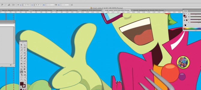
My layout pad is the most important tool as I can allow my ideas to flow easier when I’m doodling on a large piece of paper, or even a small scrap of paper. I think it comes from scribbling down layouts at Uni on the Graphic Design course. Sometimes my scribbles are like doctors notes, only legible to me, other times people have said they are actual illustrations rather than doodles. This is more likely when I’m concentrating on other things and I really have no idea what I’m drawing. Once I’ve got my ideas sorted in block format, then I work out the poses in sketch format. My characters are shaped easily from the personalities they take on, Mick Salad here is a fashion diva, eccentric fashion guru who flounces about without a care in the world (well apart from when you mix red and green which shouldn’t be seen – except on a tomato). Working in Adobe Illustrator (have been since I realised I was incapable of realistic digital art in Photoshop) allows me to have a clean sharp image that can be transformed into any size a quick rejig and it’s sorted. I use the Pen tool to create my illustratons in a digital mode and allow the curves to follow my unsteady hand creating a smooth line.